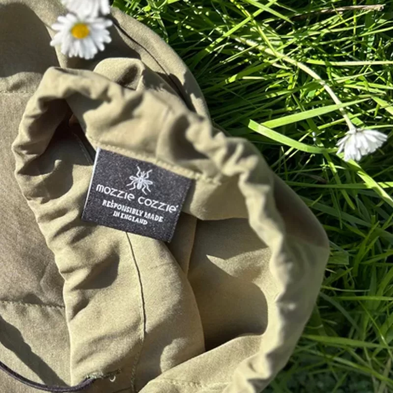
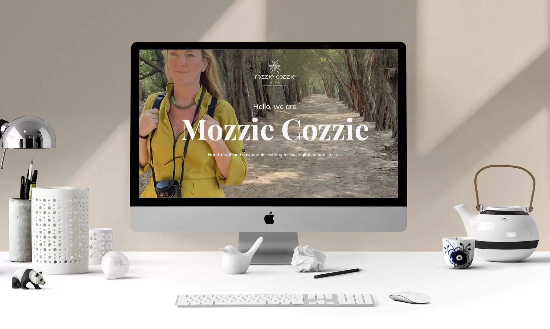
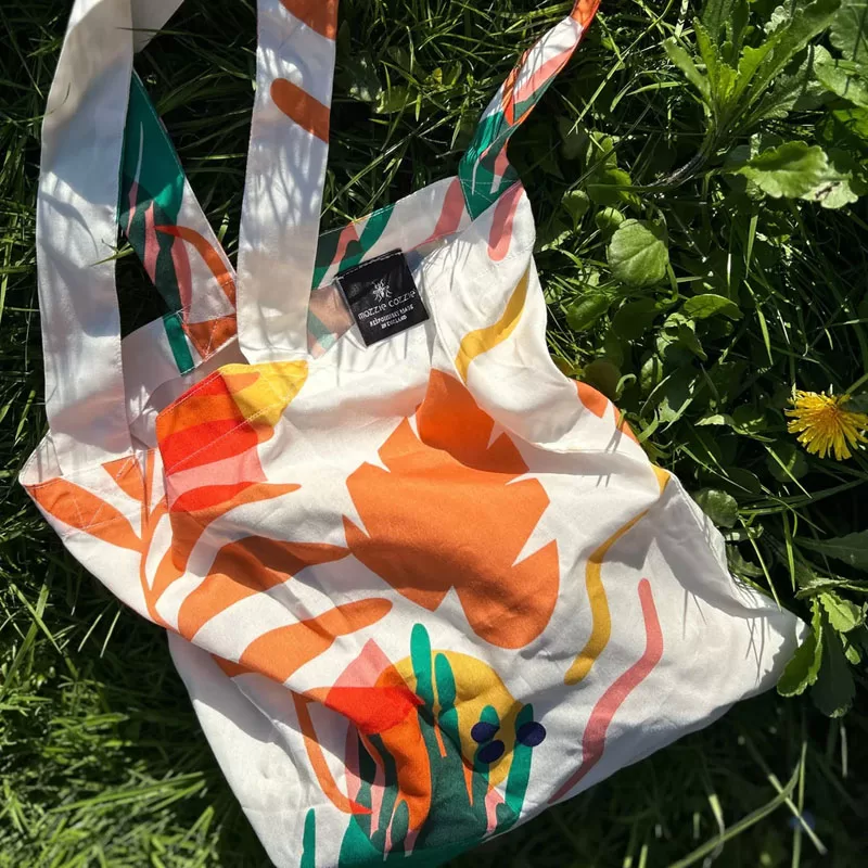
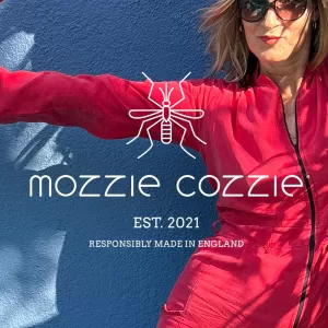
Mozzie Cozzie is the brainchild of Anna McFadyen. It is a mosquito repellent, fashion jumpsuit made from ethically sound materials and responsibly made in the UK.
Mozzie Cozzie is a modern, sleek brand. It sits easily amongst high fashion brands, whilst also appealing to digital nomads everywhere.
The brand language reflects the garments use and aesthetic, illustrating its functional quality and it’s unique design features alongside the brand’s desire to enable mindfulness and wellbeing through reconnecting the wearer with the world around them.
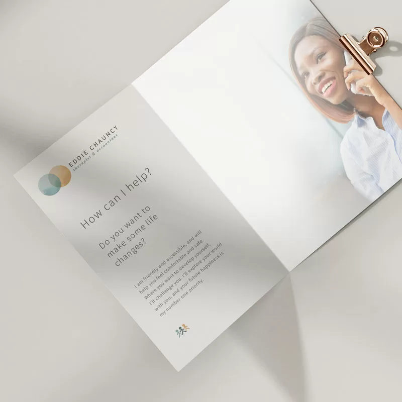
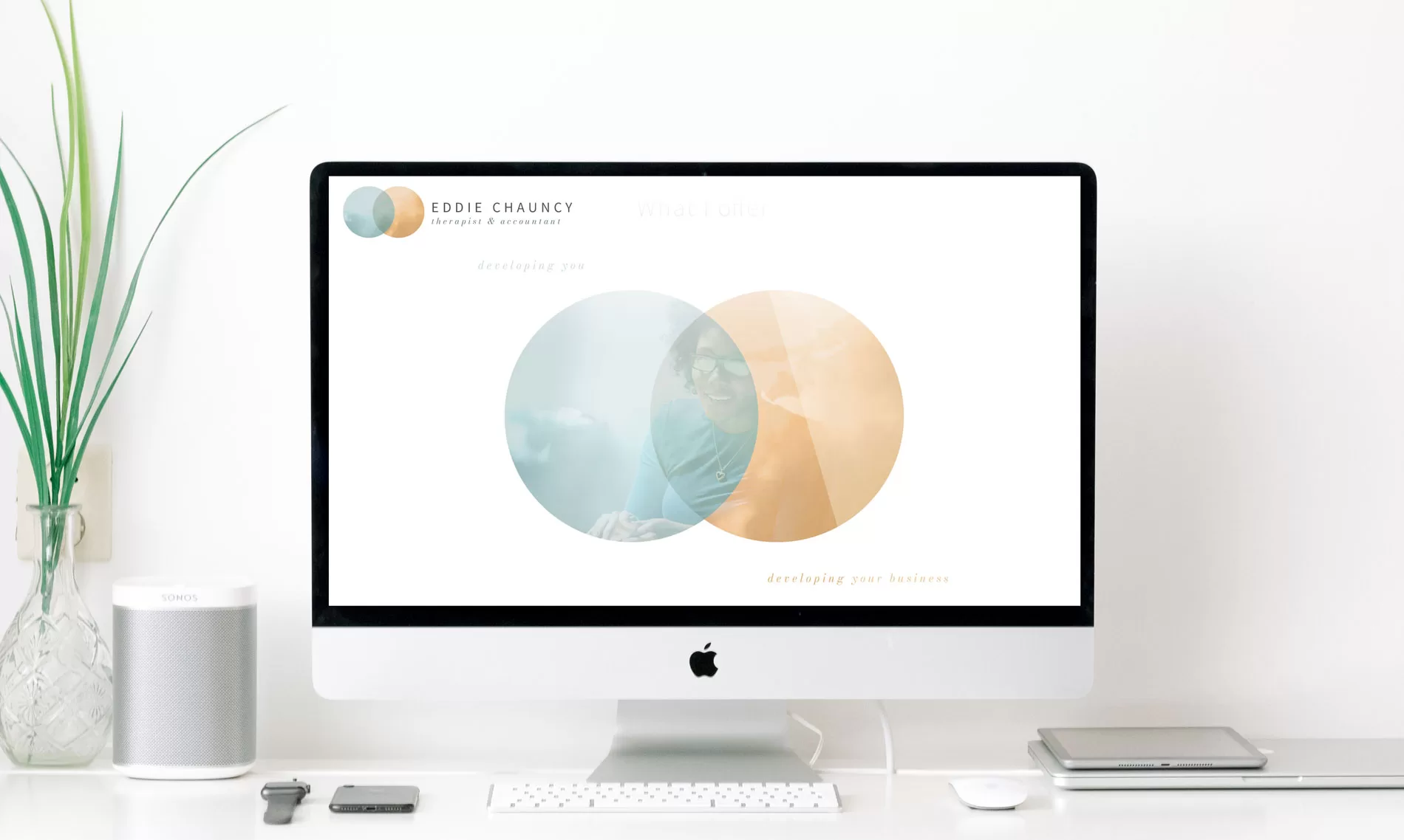
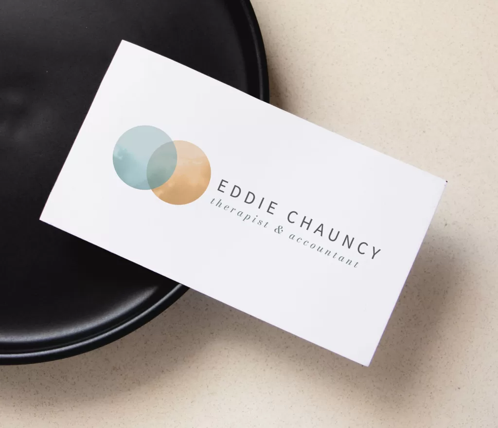
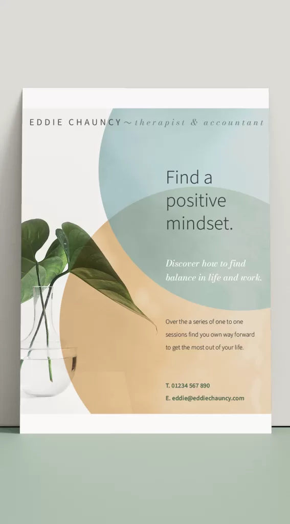
Eddie wanted a brand that would bring his two businesses under one roof. Eddie is both an accountant and a therapist working with people and businesses. His brand and his new website needed to demonstrate his expertise in both fields.
It was important that the feel and brand language reflected Eddie’s approach and philosophy, particularly the therapy side.
The look is gentle and minimalist. An uncluttered brand and website that has the potential to continue to adapt and grow with both businesses.
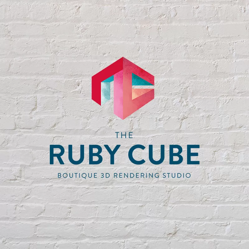
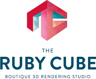
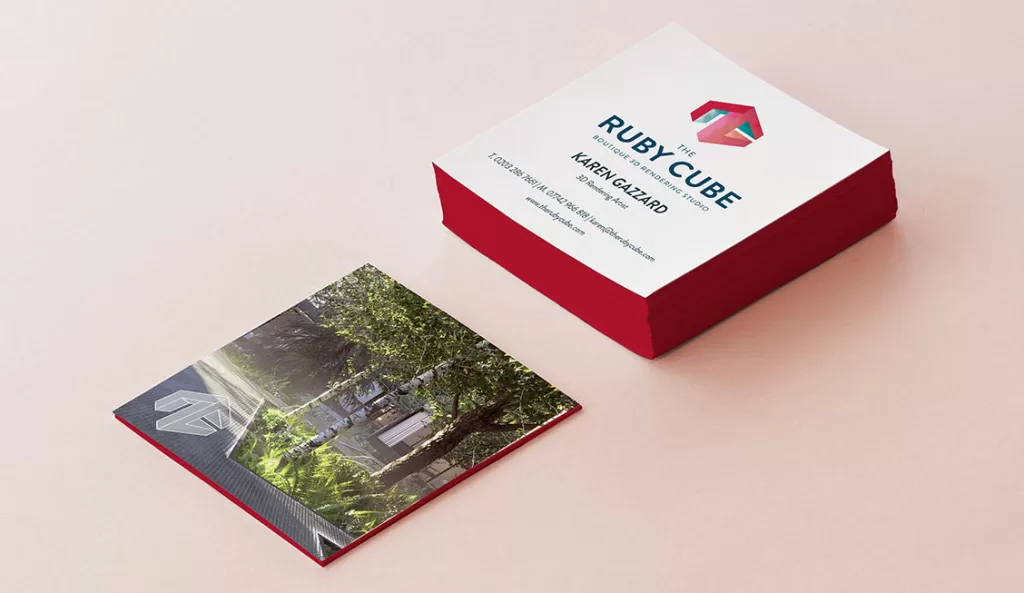
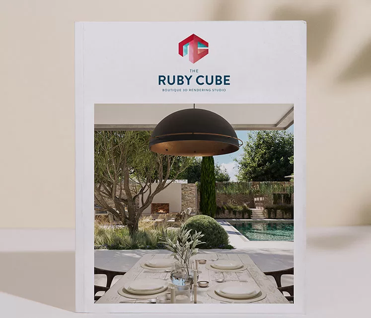
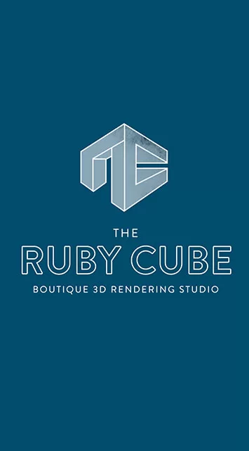
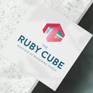
The Ruby Cube boutique 3D rendering studio wanted a unique and distinct logo that would compliment their visuals and work well as a watermark. It needed to be representative of the work that they do whilst not overpowering the beautiful visuals that they create.
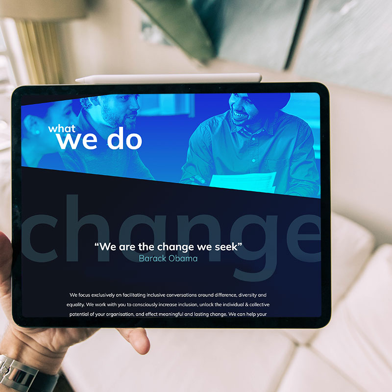
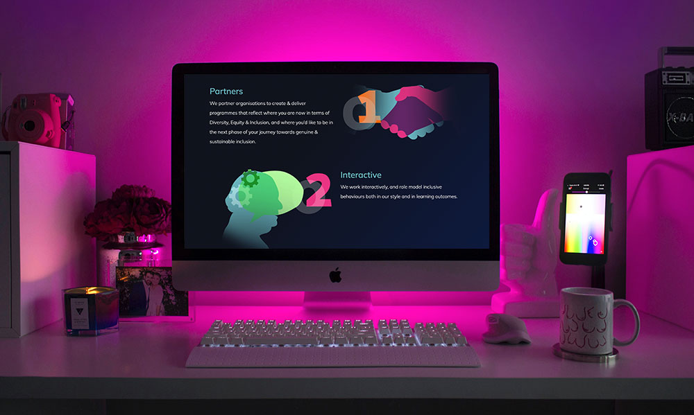
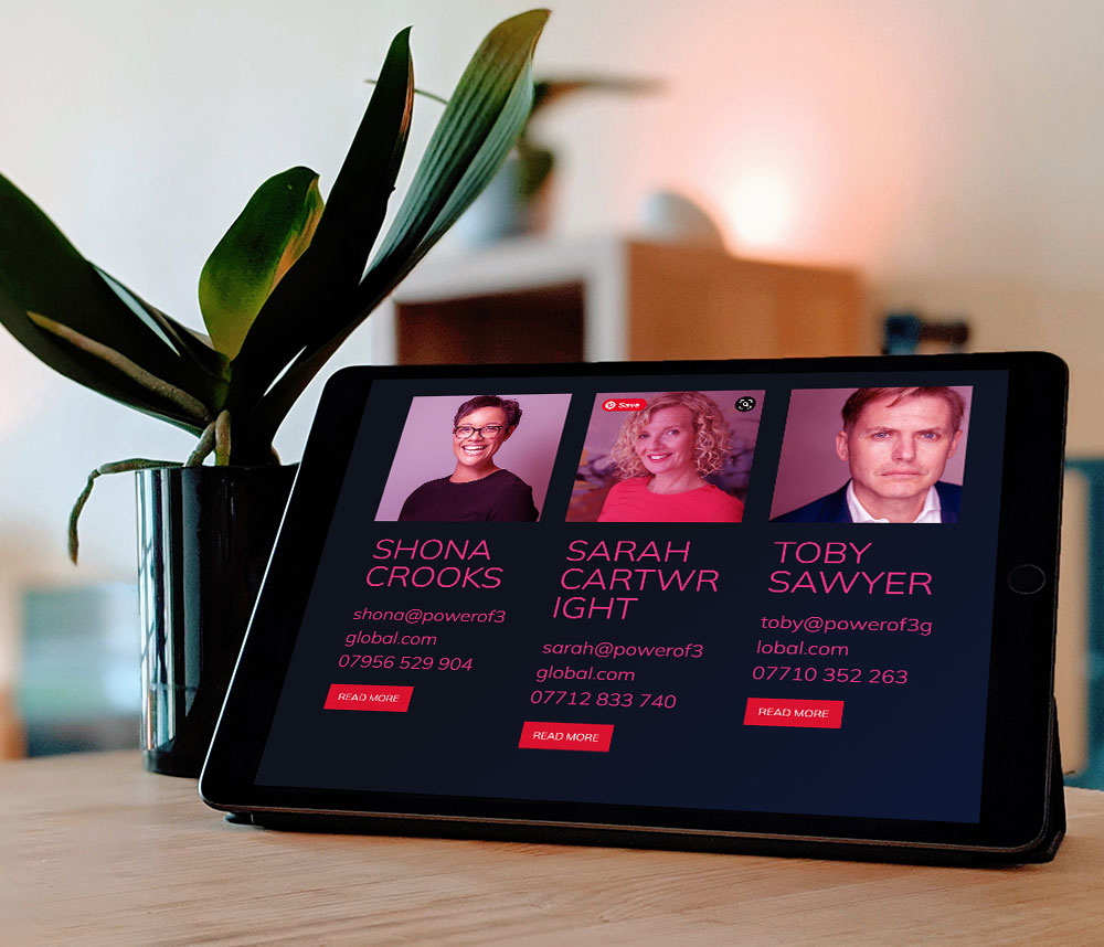
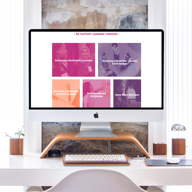
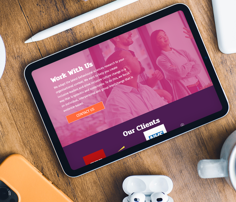
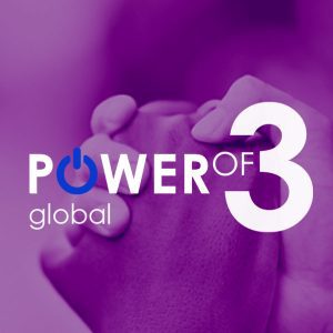
Power of 3 Global is a business founded by Shona Crooks, Sarah Cartwright and Toby Sawyer, to break down barriers to diversity, equity and inclusion. The company works with businesses to consciously increase inclusion and unlock the individual and collective potential of organisations.
The website design needed to be clear and consistent with bold, memorable style. We included subtle css animation to enrich the experience but not overwhelm the user. The end result showcases their business through both content and design. Meaningful imagery compliments strong, standout typography to deliver the whole message.
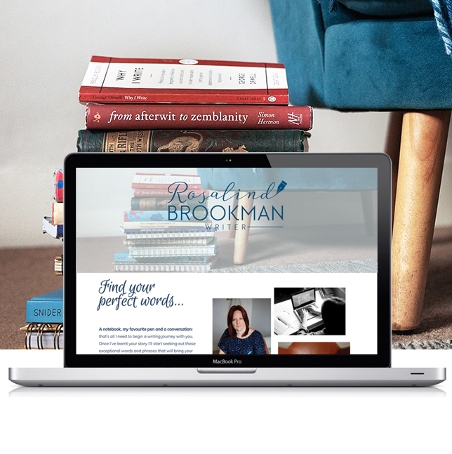
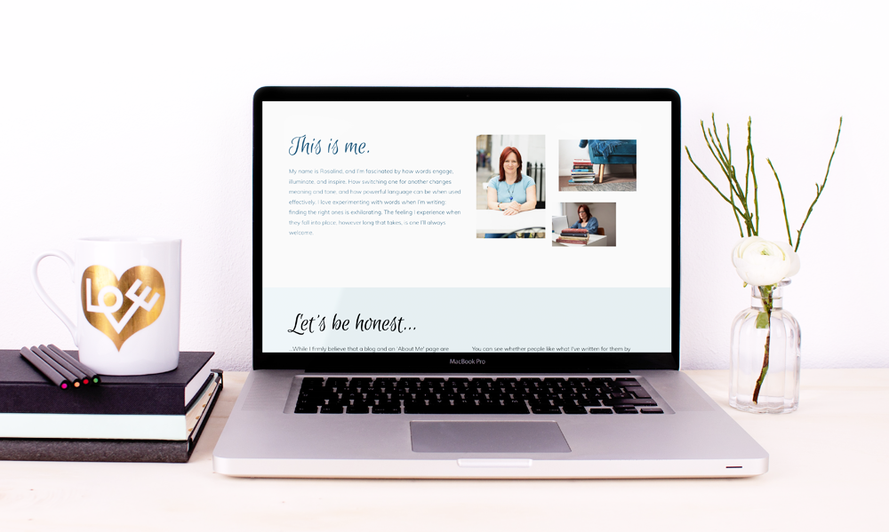
Designing Rosalind’s website was a process of expanding her visual brand language. Rosalind already had her logo, but needed a website that reflected her writing and how she works with others.
We developed a cohesive brand style, selecting typefaces that work with her logo, colours that are warm but light, and imagery and iconography that reflect Rosalind’s writing process.
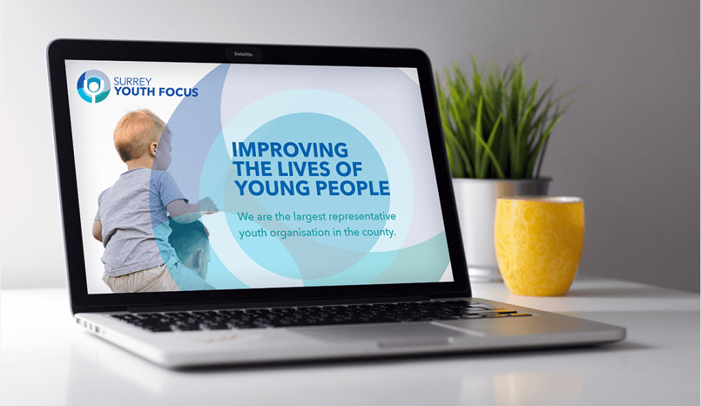
“ We have received so many compliments on our lovely new branding. ”
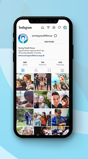
– Jen, Surrey Youth Focus
Staying true
Modernise without loosing our heart
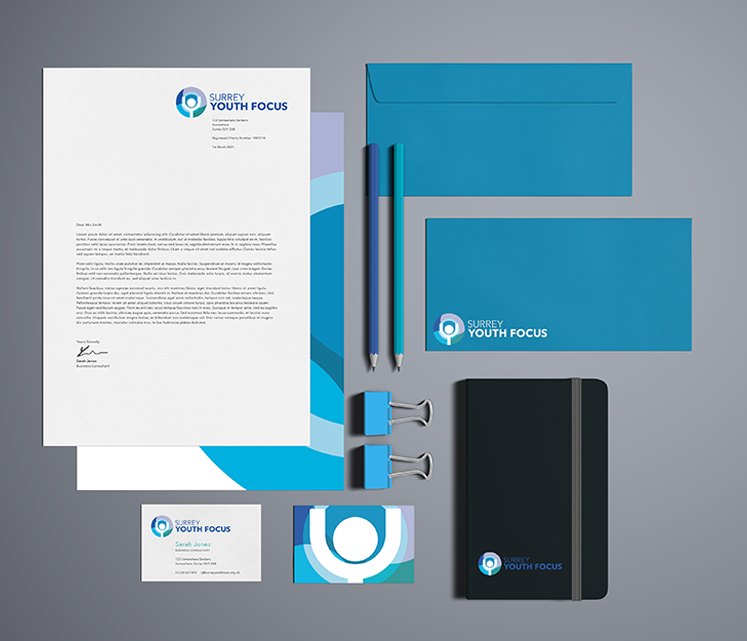
Surrey Youth Focus wanted to update their brand without making it unrecognisable from the old branding. A new typeface and refreshing the icon background has given the brand a new lease of life, while keeping the logo structure and figure at the middle of the icon respects the brands history.
A website that truly represents the organisation and it's clients
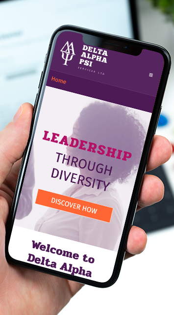
Delta Alpha Psi is an organisation that helps business leaders get the best out of diversity in their businesses.
Delta Alpha Psi wanted a website that would represent them and what they do. Images needed to be diverse and the brand upheld across the site using the brand’s strong colour palette.
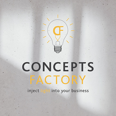
Gabriele Richardson established Concepts Factory in 2018 and wanted to update and modernise the logo. The business was in the process of becoming better known and expanding into new areas, she want to reflect this in the new logo.
I sort create a professional, sleek logo that remained true to the original concept. We kept the original colours and updated the typeface, illustration and typography to create a fresh and modern look that we then applied across print templates.
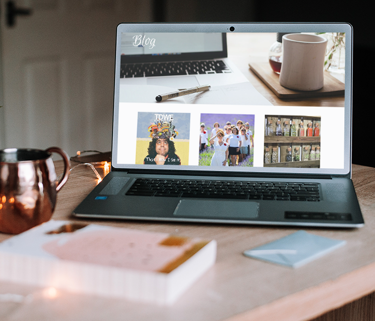
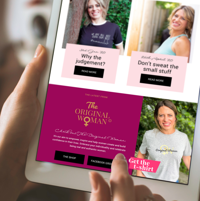
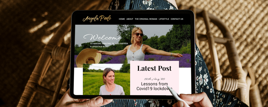
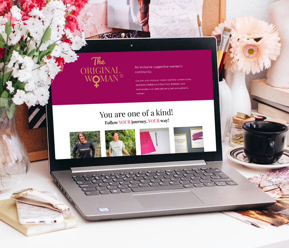
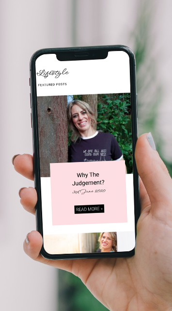
Angela didn’t want to start from scratch but wanted an updated look for her homepage. During our initial meeting it became clear that Angela’s content could do much more than it had been doing for her.
I made it my aim to pull together the content that Angela was producing for her blog, Instagram and her online shop in a way that would engage her target audience when they landed on her homepage.
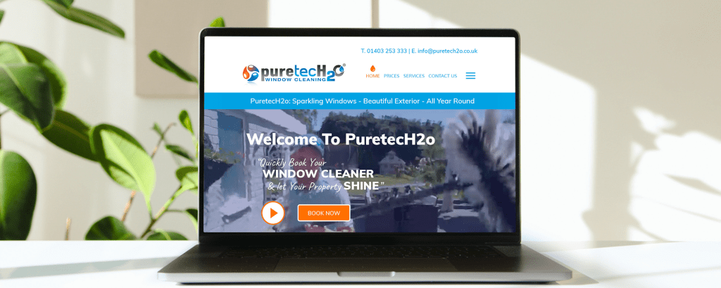
“Our website now looks so bright and fresh thank you”
– PuretecH2o
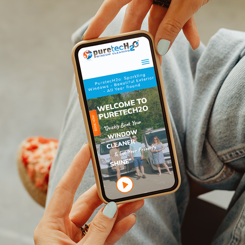
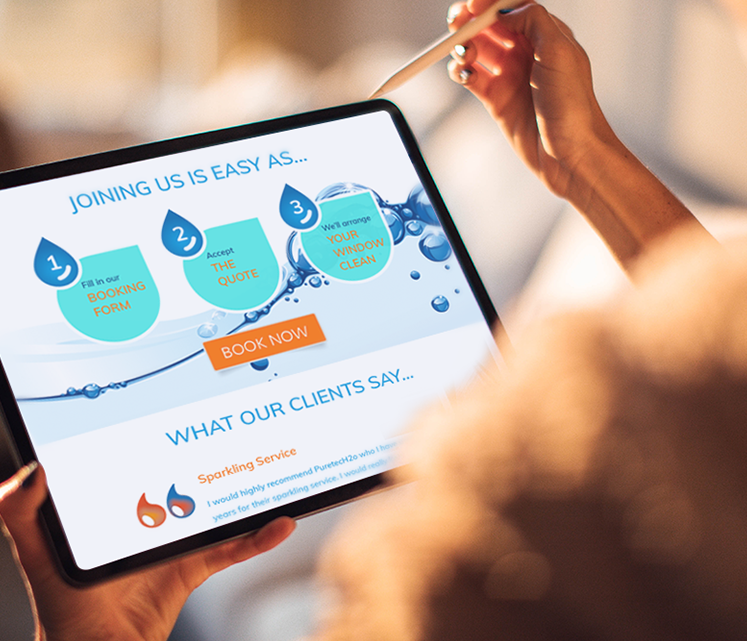
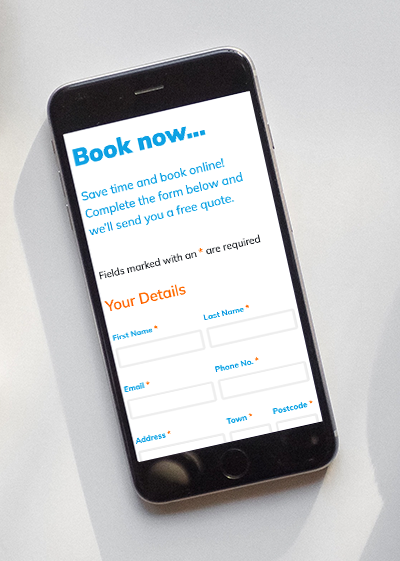
Standing out from the crowd
A website to remember
PuretecH2o wanted a website that people would remember and would stand out from websites for other window cleaning companies. It needed to be bright, cheerful and in places a bit cheeky to reflect the brand and the team.