“ We have received so many compliments on our lovely new branding. ”
– Jen, Surrey Youth Focus
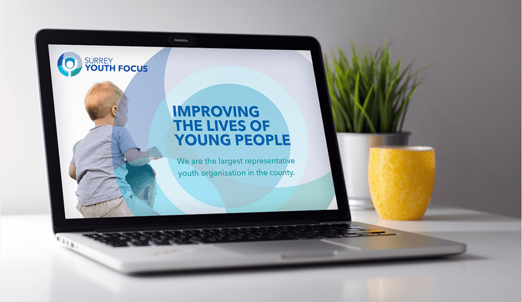
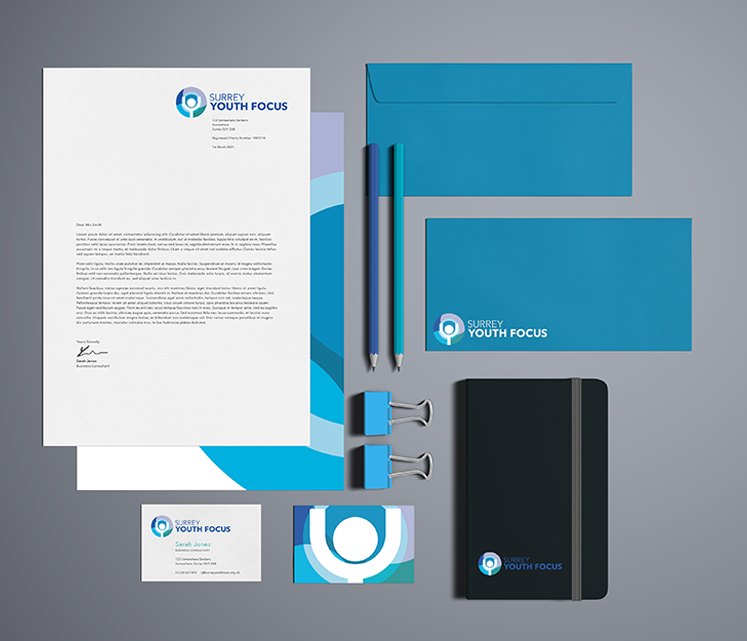
Staying true
Modernise without loosing our heart
Surrey Youth Focus wanted to update their brand without making it unrecognisable from the old branding. A new typeface and refreshing the icon background has given the brand a new lease of life, while keeping the logo structure and figure at the middle of the icon respects the brands history.