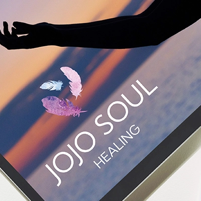
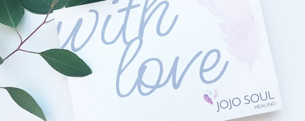
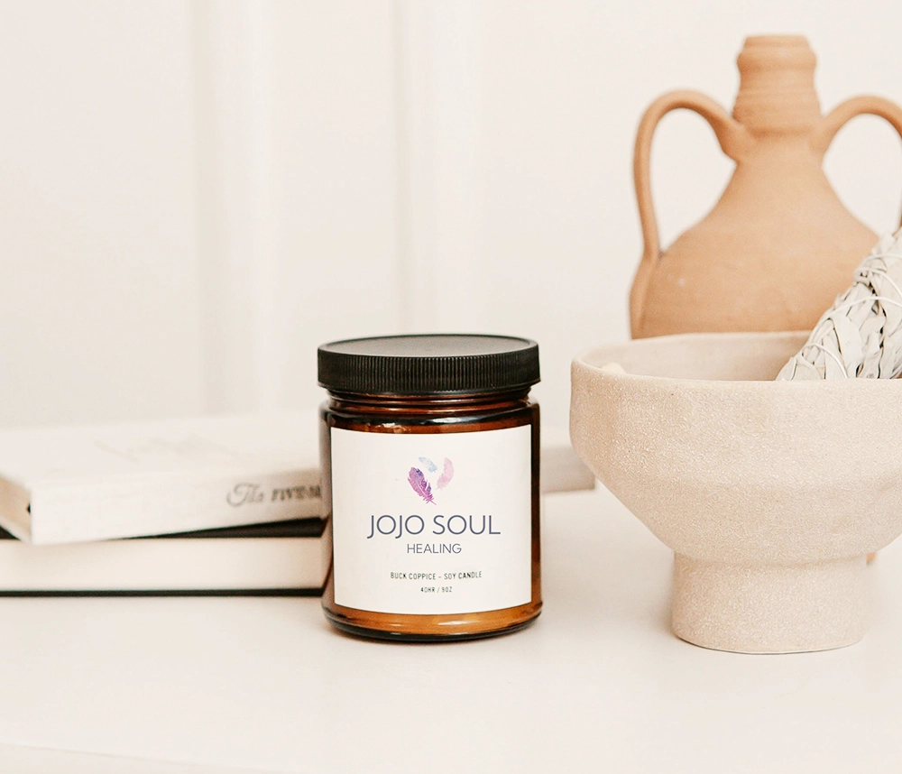
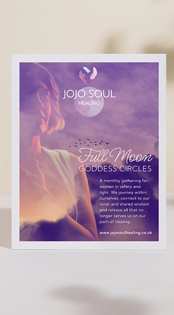
Jo a Reiki Master Teacher, Angelic Healer and Soul Guide based in Guildford, who works with her clients to help them on their own personal journey of healing and self-discovery.
The JoJo Soul brand overall look and feel is now gentle and nuturing. Jo is a kind and gentle soul, and this is echoed in her practice and her business.
The look is modern, clean and minimalist, but includes soft, feminine colours and beautiful, quiet, imagery depicting moments of calm, wellbeing and nature.
Similar Projects
JoJo Soul Healing
Speedwell Coaching
Emma Martin Mindfulness
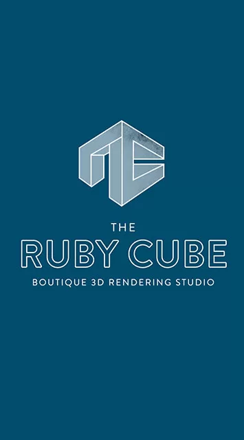
The Ruby Cube
Branding
Unique to us
A brand to compliment the work
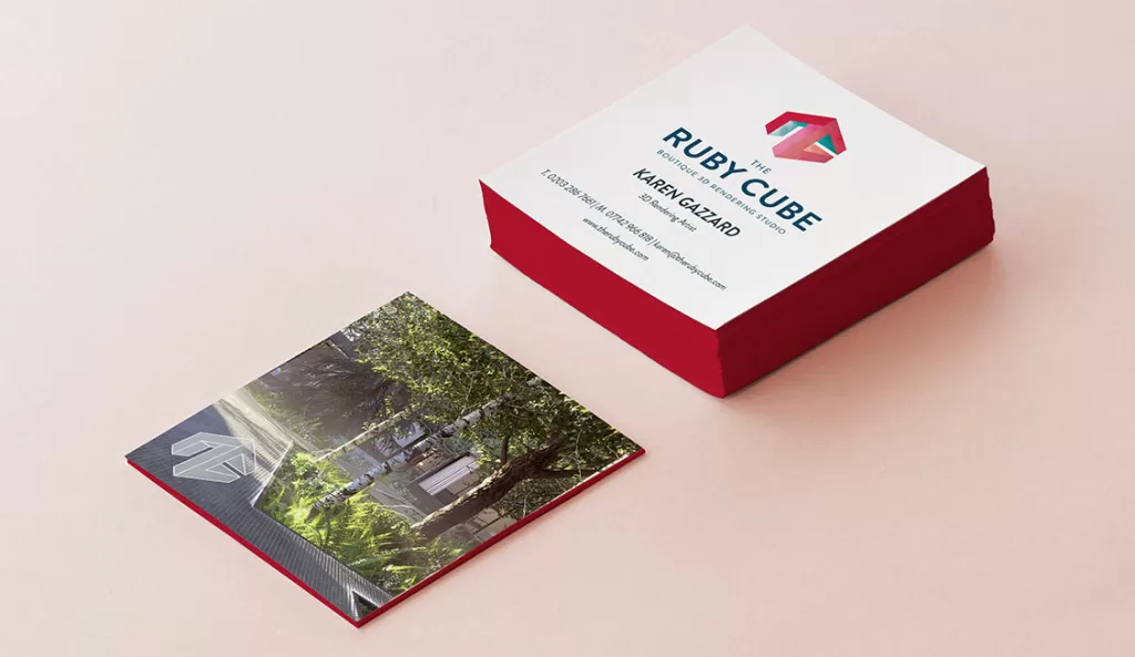
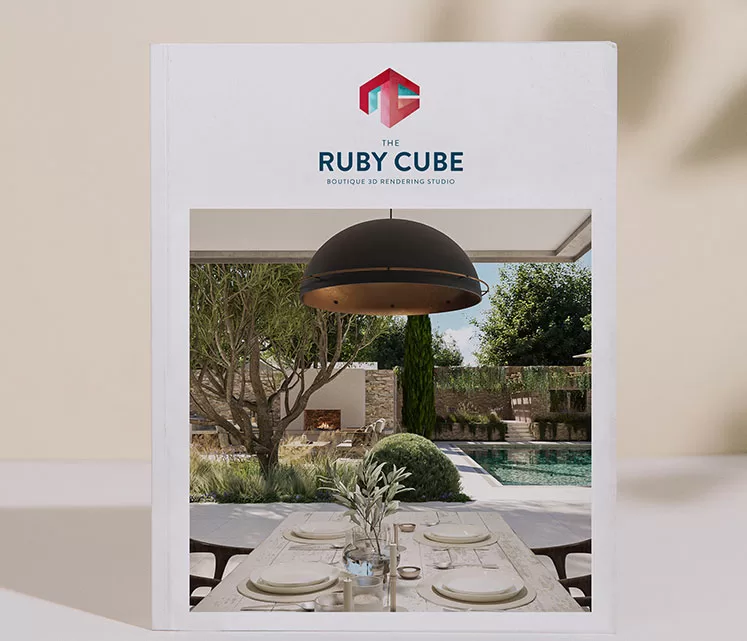
The Ruby Cube boutique 3D rendering studio wanted a unique and distinct logo that would compliment their visuals and work well as a watermark. It needed to be representative of the work that they do whilst not overpowering the beautiful visuals that they create.
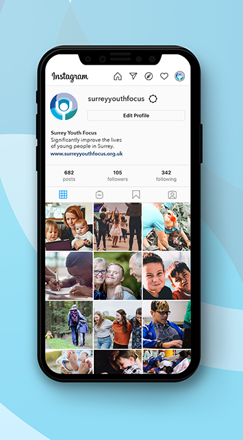
“ We have received so many compliments on our lovely new branding. ”
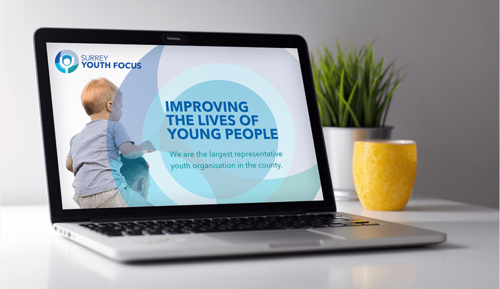
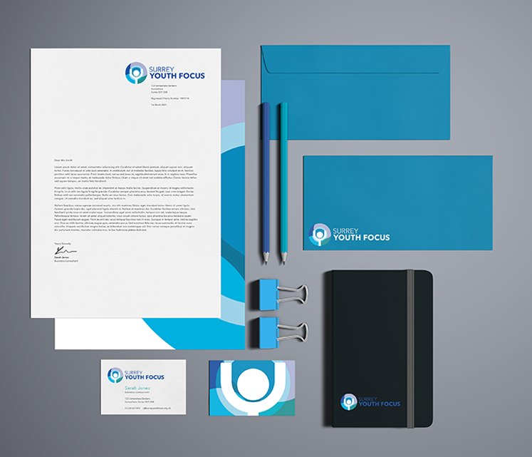
– Jen, Surrey Youth Focus
Staying true
Modernise without loosing our heart
Surrey Youth Focus wanted to update their brand without making it unrecognisable from the old branding. A new typeface and refreshing the icon background has given the brand a new lease of life, while keeping the logo structure and figure at the middle of the icon respects the brands history.
Similar Projects
JoJo Soul Healing
Speedwell Coaching
Mozzie Cozzie
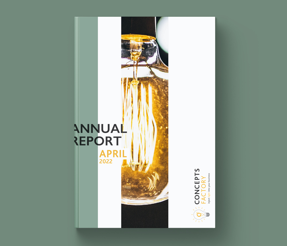
Concepts Factory
Brand Refresh & Print Material
Refresh & apply
Making an established brand feel fresh
Gabriele Richardson established Concepts Factory in 2018 and wanted to update and modernise the logo. The business was in the process of becoming better known and expanding into new areas, she want to reflect this in the new logo.
I sort create a professional, sleek logo that remained true to the original concept. We kept the original colours and updated the typeface, illustration and typography to create a fresh and modern look that we then applied across print templates.